


Many smartphone users have recently noticed unusual changes in their dialer menu and contacts list. At first glance, these adjustments may appear like a technical glitch or even a security issue, but they are actually the result of Google’s new design update for its Phone app.
The company has been working on refreshing the look and feel of its key apps, and the Phone app is one of the latest to receive a makeover.
The update is part of Google’s broader shift to its Material 3 design language, which is now being applied across many of its services. Material 3 is all about creating a cleaner and more unified look that gives users a simpler and more consistent experience.
The Phone app update, now available from version 186 and above, reflects this focus by reducing clutter and making navigation easier.
One of the biggest changes is the merging of the Favourites and Recents tabs. Instead of switching between separate sections, both now sit within a single Home tab. Your starred contacts are arranged in a row at the top of the screen, while your call history appears right below.
This setup reduces extra taps and makes it easier to see who you contact most often at a glance. The keypad has also been repositioned. Instead of being a floating button, it now takes its place in the middle tab.
The number pad has been redesigned too, featuring a sheet-style look with rounded corners that fits well with Google’s modern design approach.
Contacts, meanwhile, no longer sit on a bottom tab but can be found through the navigation drawer. You can access them by tapping the search bar, which also opens up options like Settings, Clear call history, and Help.
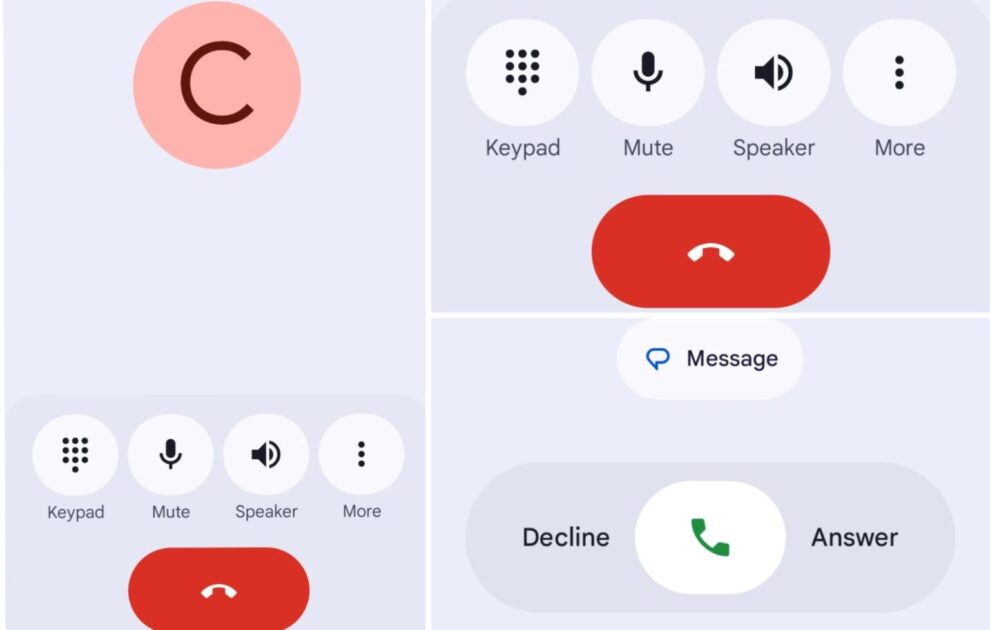
Answering and rejecting calls has changed too. The old swipe-up and swipe-down method has been replaced by a horizontal swipe or a single tap. This new system aims to reduce accidental actions, such as unintentionally answering or declining calls while pulling the phone out of a pocket.
Google says the change gives users more control and fewer frustrations.
The voicemail section has been updated as well. It now uses a list-style view that blends smoothly with the rest of the design, though its core functions remain unchanged.
For those who dislike the new layout, there is a temporary option to undo the changes by uninstalling updates through the Play Store. However, since Google is also pushing updates from its servers, some users may find the new design applied automatically even after rolling back.
In the long run, these updates reflect Google’s direction toward a more polished and uniform ecosystem.
While the redesign may feel unfamiliar at first, it introduces improvements in navigation, appearance, and usability. For most users, adjusting to the changes will likely become easier over time, as the new interface becomes the standard across Android devices.


Add Comment